story one
TRANQUIL


How should your home make you feel? This question was the inspiration behind the design of our color palettes and Color of the Year for 2026.
In a fast-paced world, we’re all looking for spaces that bring us comfort and restore a sense of balance. Choosing colors for these spaces shouldn’t be a challenge, which is why we’ve created two palettes of harmonizing colors ready to transform your home. Whether you find your calm in cool and quietly colored spaces or you’re more drawn to the comfort of earthier hues, we have a color just for you.
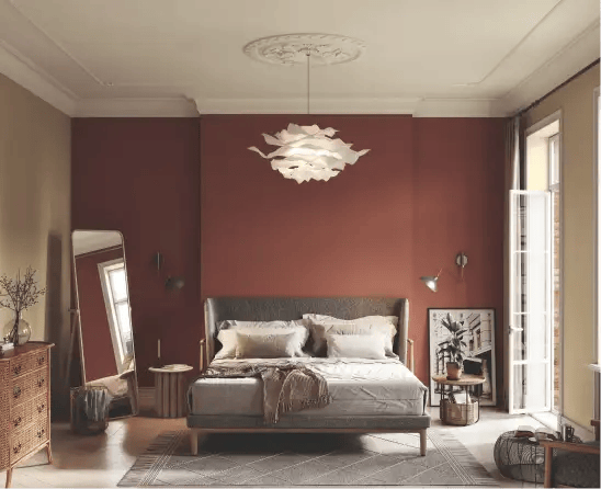
The Color of the Year strikes the perfect balance of familiarity and boldness.
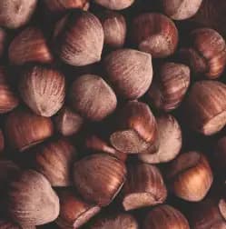
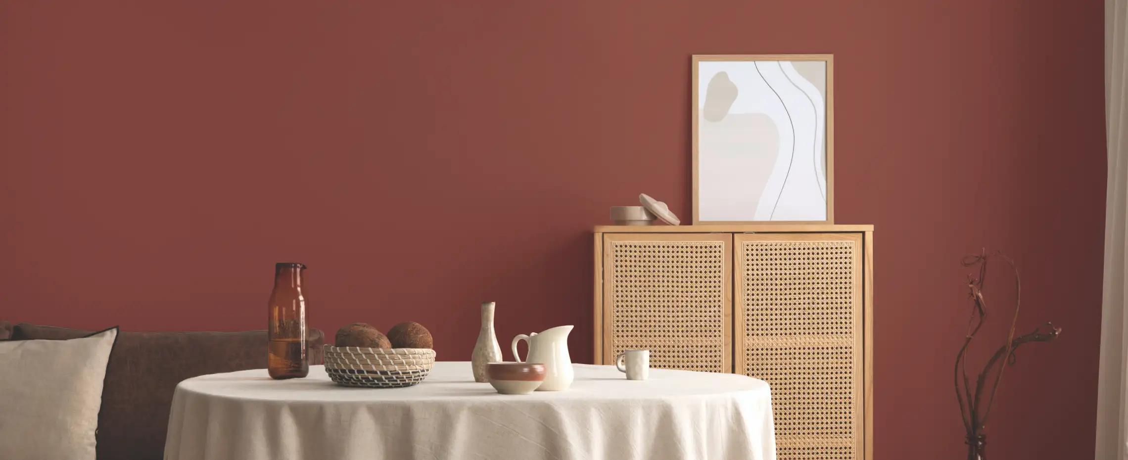
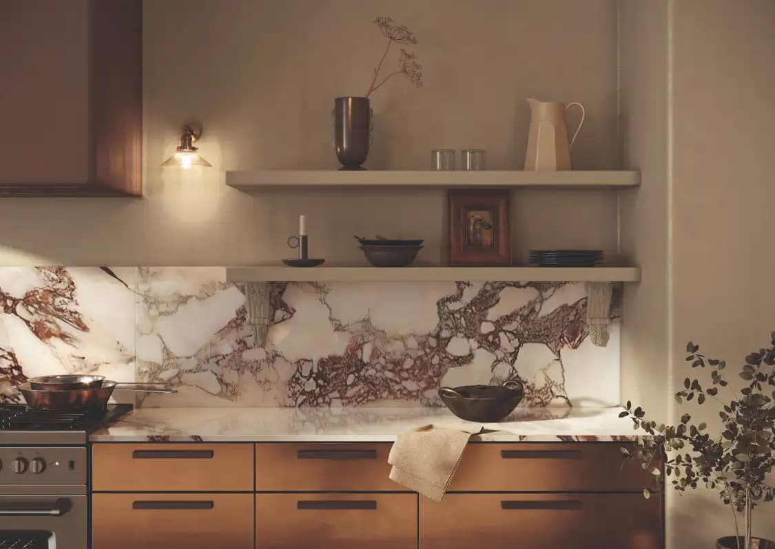
Deep and warm Hazelnut Crunch is a beautiful backdrop for relaxed living. Style with natural woods, ceramics, and soft upholstery and make yourself feel at home.
09A-5 Hazelnut Crunch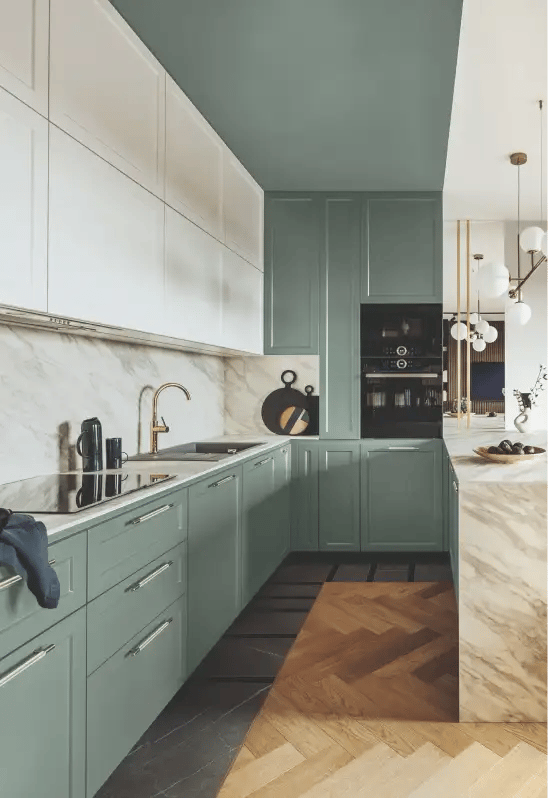
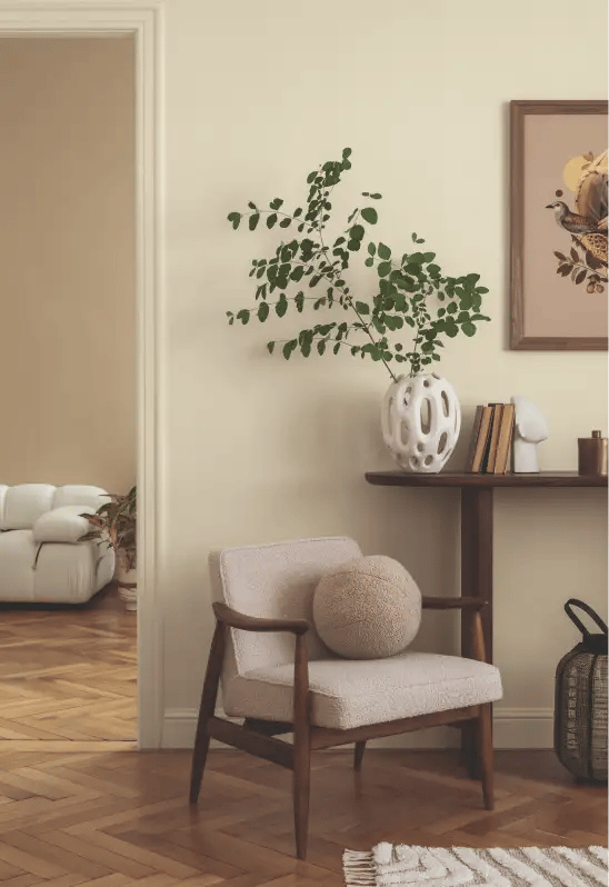
With a gentle presence, these are colors that whisper rather than shout. Perfect for timeless kitchens and stylish living spaces, you can realize an effortlessly relaxed atmosphere with these softly shaded, mineral-like hues.
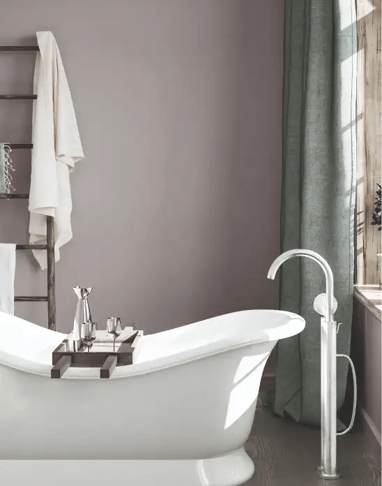
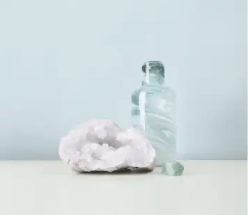
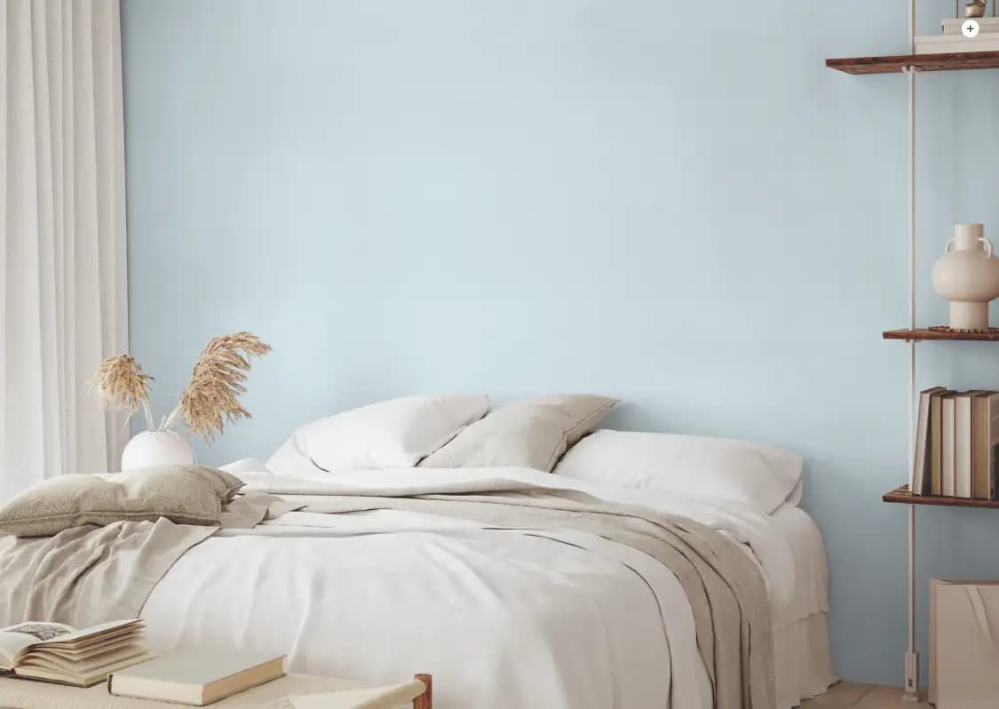
When we think about rest and relaxation, bedrooms and bathrooms come to mind. From intriguingly nuanced neutrals to clean and delicate pales, choose colors from our Tranquil palette to transform any space into a haven of calm.
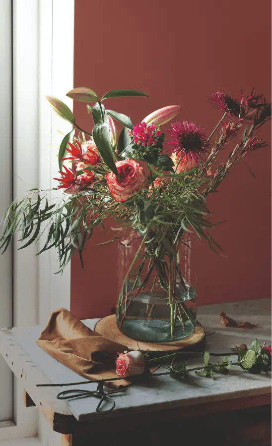
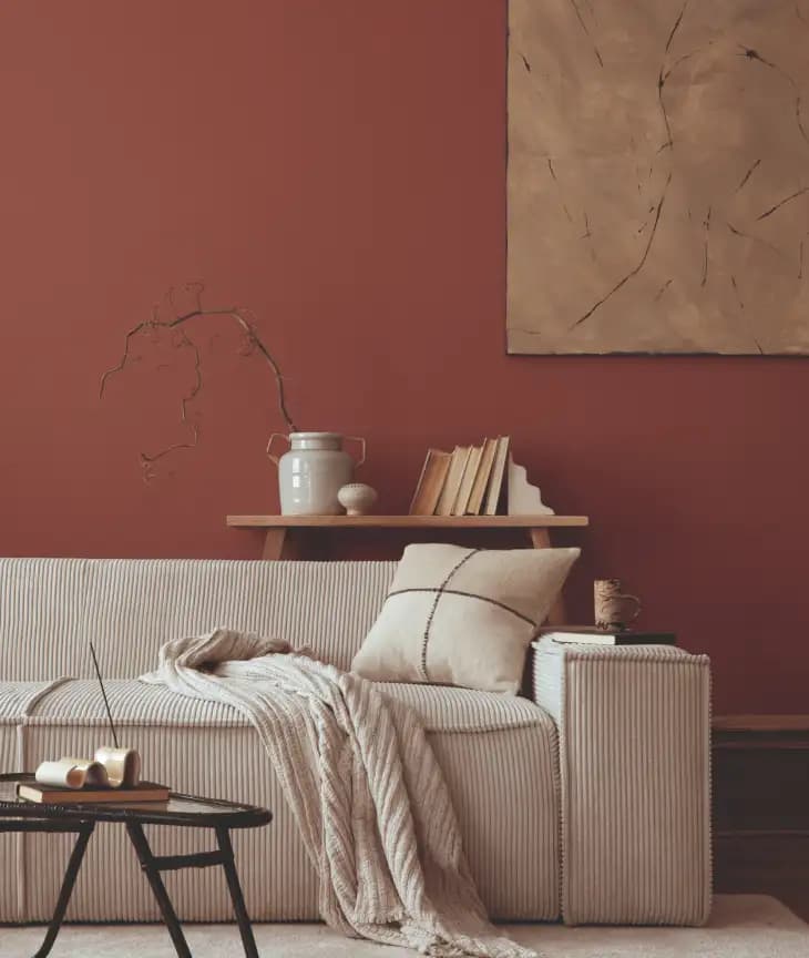
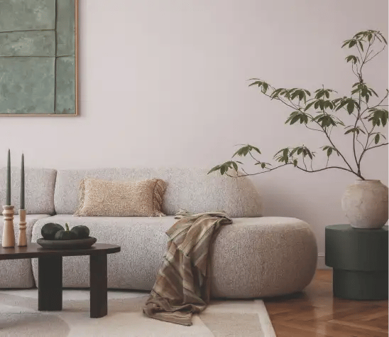
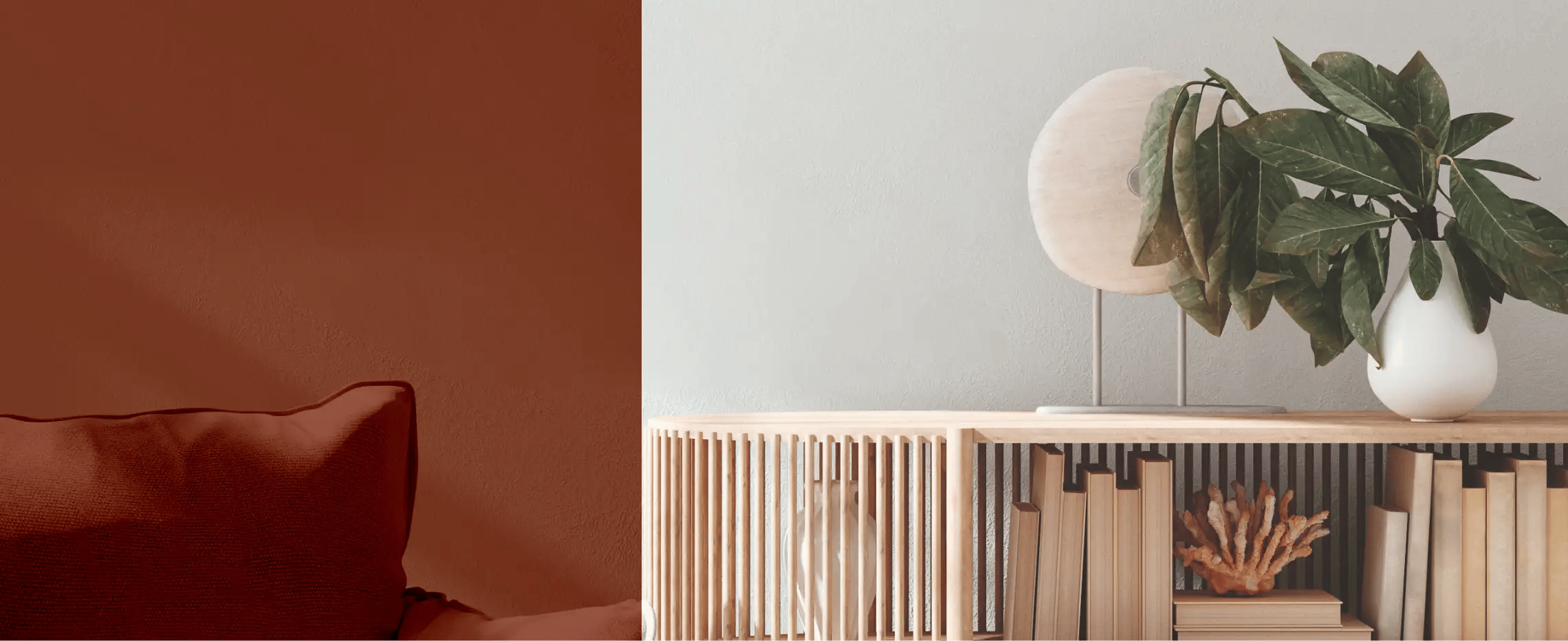
Bringing comfort to your home is as simple as layering these neutral and natural hues inspired by the warmer side of nature. For a softer approach, connect adjoining rooms with gently transitioning neutrals, or make a beautiful statement with an immersive feature wall.

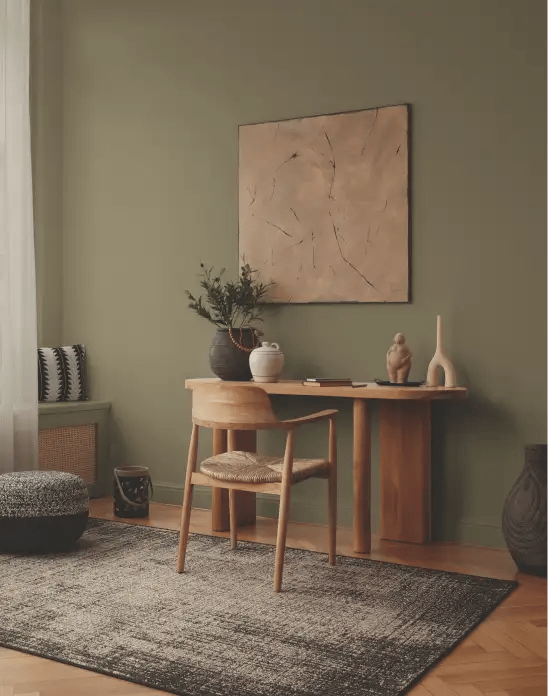

From wood and rattan to ceramic and stone, our Grounded palette is designed to form an elegant backdrop for natural and organic materials. Embrace and enhance the raw beauty of nature for a truly welcoming home.
The process of choosing colors is a creative experience that helps unlock new possibilities for your home. This palette of coordinating colors was created by our team of design experts to help make color selection an easy and rewarding exercise.
Every gallon of Clark+Kensington paint is designed to deliver amazing results within your budget. With so many vibrant colors to choose, you can create your own color scheme or select any of the beautiful colors in this palette.
Ready to start your paint project? Your local Ace is ready to help you get everything you need in one trip.